Visualizing Space-Weather Data for Intuitive Decision-Making
Intro: Why Numbers Alone Can Be Misleading
For most HF operators, space weather data comes as an endless stream of numbers—Kp, A-index, solar flux, sunspot counts. The problem? Numbers are abstract. Without context, they don’t tell you whether 20 meters will be wide open to Europe or dead quiet by nightfall.
That’s where visualization changes the game. By turning raw indices into clear, intuitive graphics, you can make propagation decisions in seconds—without having to decode a wall of digits.
1. The Problem with Raw Data
 Consider this scenario:
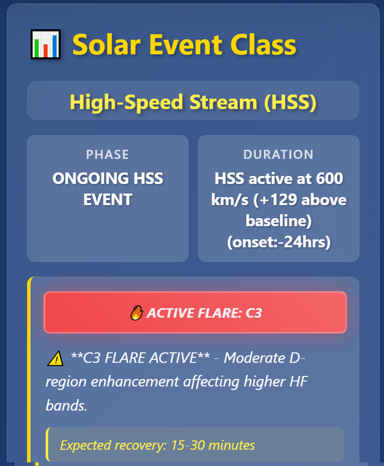
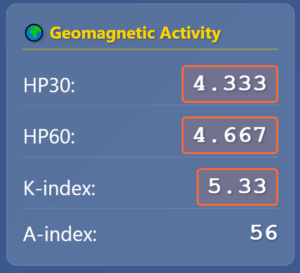
- Kp = 5.33
- A-index = 56
- Solar wind speed = 580 km/s
- Bz = –6 nT
Individually, these numbers mean little to the untrained eye. Is the band about to collapse? Will a polar path work? Should you QSY to 40 meters? Without a mental model, you might miss opportunities or waste precious operating time. Just a simple highlight like this orange box around the raw data show you instantly that the value is not-optimal. If you need to dig deeper, you always can, but seeing this allows you to quickly make a decision on your operating strategy.
2. Turning Data Into Action
 On SolarCdx.com, we tackle this by mapping raw values into visual states:
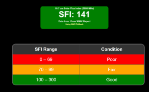
- Color coding that instantly signals band health (green/yellow/red).
- Trend lines showing whether conditions are improving or degrading.
- Combined gauges that merge multiple indices into a single “go/no-go” visual.
Example:
- A green HPI gauge trending upward → potential high-latitude openings.
- A red solar wind speed gauge with falling Bz → polar blackouts likely.
These visuals don’t replace numbers—they make them actionable.
3. Intuitive Decision-Making
When space weather is changing fast, you don’t have time for mental math. Visualizations allow:
- Pattern recognition: Spot the “shape” of a storm’s arrival or recovery phase.
- Historical comparison: See if today’s curve matches last week’s “good DX” event.
- Quick risk assessment: Decide whether to chase DX now or wait for a better window.
Example: A CME timeline chart with clear “impact” and “recovery” zones lets you know when to expect HF blackout, when to try auroral paths, and when to resume normal operation.
4. The SolarCdx Advantage
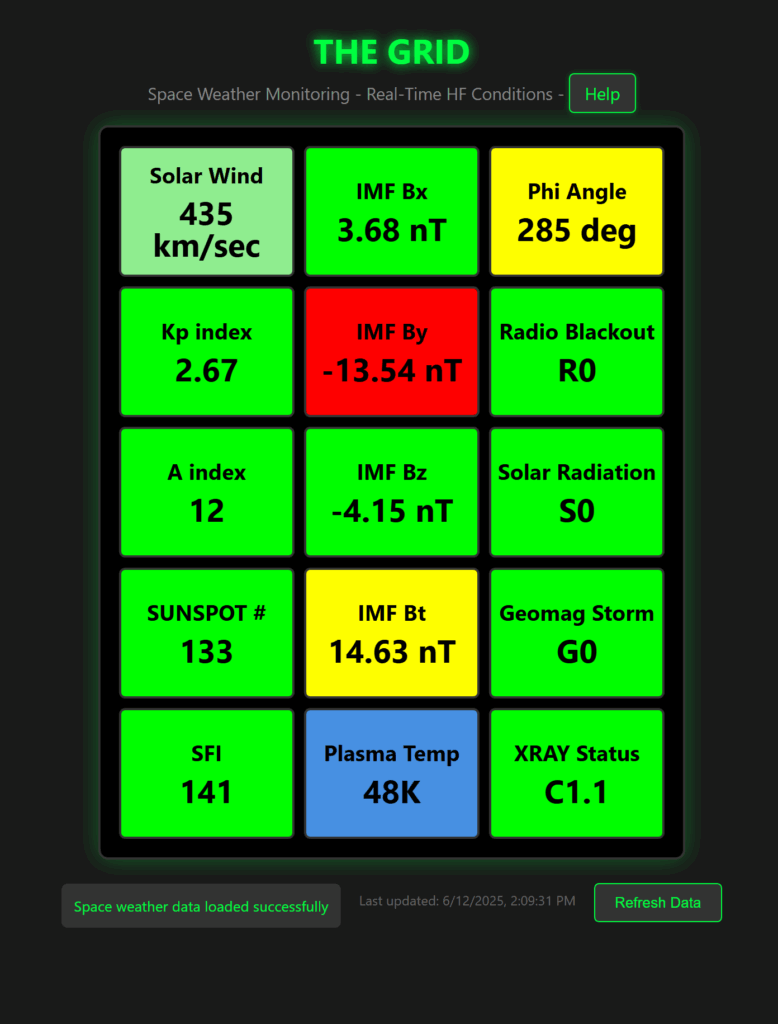 We integrate multiple visualization layers into one dashboard:
- HPI Gauges — for hemispheric ionospheric power
- Solar Wind Panels — speed, density, and Bz all in one glance
- Band Trend Plots — historical shifts over hours or days
- Event Timelines — CME vs CH HSS impact progression
By reading pictures instead of numbers, operators can act faster and with greater confidence.
5. The Bottom Line
You don’t have to be a space physicist to make smart HF decisions—you just need the right visualization tools. SolarCdx.com puts those tools at your fingertips, translating space weather complexity into something you can use right now on the air.